Campora
Designed an app and a responsive website for a camping supply store to advertise and sell its products. Brand identity development, UI, UX Design using Figma.
My Role
Lead UX designer, UX researcher
Client
Campora
Year
2024
The goal is to create an user-friendly intuitive digital experience across the website and mobile app for the camping supply store that enhances product visibility, seamless navigation, and simplifies the online shopping experience. The end goal was to increase customer satisfaction and support scalable business growth.
— The Goal
The business lacked an online presence and wanted to expand its reach by creating a digital storefront. The challenge was to design a responsive website and mobile app that effectively advertises and sells camping products. The experience had to be seamless, with secure payments and integration with inventory and order management systems. The had to ensure a seamless user experience, secure payment processing, and smooth integration for inventory and order management across both platforms.
— The Problem
Role: Lead UX designer, UX researcher
Overseeing the design process;
Ensuring a user-centered approach;
Conduct User research, wireframing, prototyping;
Gather user insights, define product requirements, and develop high quality designs while ensuring technical feasibility and consistency across all platforms.
— Responsibilities
User research
Summary
For my user research, I conducted a combination of qualitative and quantitative methods, including user interviews, surveys, and usability testing to understand the needs, pain points, and behaviors of potential customers. Initially, I assumed that users would prioritize a quick and easy checkout process, with minimal focus on product details. However, after conducting the research, I found that users valued detailed product descriptions, reviews, and clear navigation over a simplified checkout process. This shift in understanding led to a redesign that emphasized product transparency and information accessibility, improving overall user satisfaction.
User Interviews (10 participants)
Online Survey (120 respondents)
Usability Testing of competitor sites
Empathy Mapping & Persona Development
Interview Planning
Recruited participants with varying outdoor experience (casual campers, backpackers, and seasoned hikers).
Asked open-ended, neutral questions like:
"Can you walk me through how you usually buy camping gear online?"
"What’s most important to you when comparing gear?"
"Tell me about a frustrating experience you've had buying outdoor gear online.”
Key Insight
Initial assumption: Users prioritize fast checkout.
Actual insight: Users highly value detailed product information, user reviews, and comparison tools. A fast checkout is important but comes after confidence in the product is established.
Pain Point
User struggles with navigating websites with cluttered layouts, which makes it difficult to quickly find products or categories they are interested in.
Pain Point
The checkout process can be overly complicated, leading to frustration and abandoned carts due to excessive forms and unclear payment options.
Pain Point
Mobile app users can experience slow loading times, which disrupts the shopping experience and causes users to leave the app before completing purchases.
Pain Point
Users are unable to easily compare products, which made it challenging to make informed purchasing decisions, especially when evaluating similar camping gear.
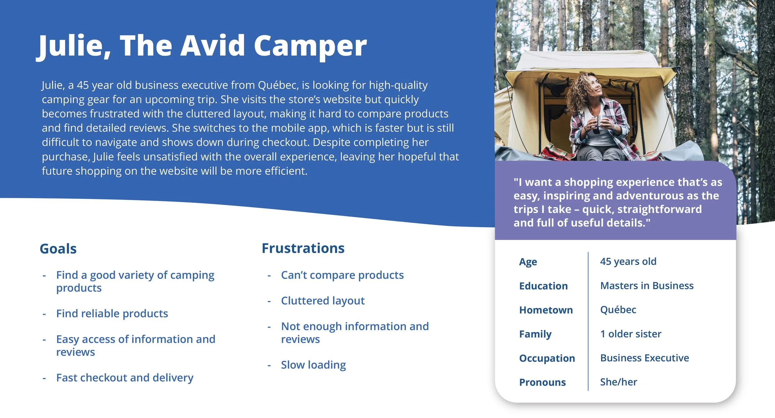
Persona: Julie
Problem statement:
Julie is a busy executive, avid camper and gadget lover who needs to easily find, compare and purchase camping supplies because she is always travelling and on the go.
Persona: Andre
Problem statement:
Andre wastes time digging for product specs across multiple sites.
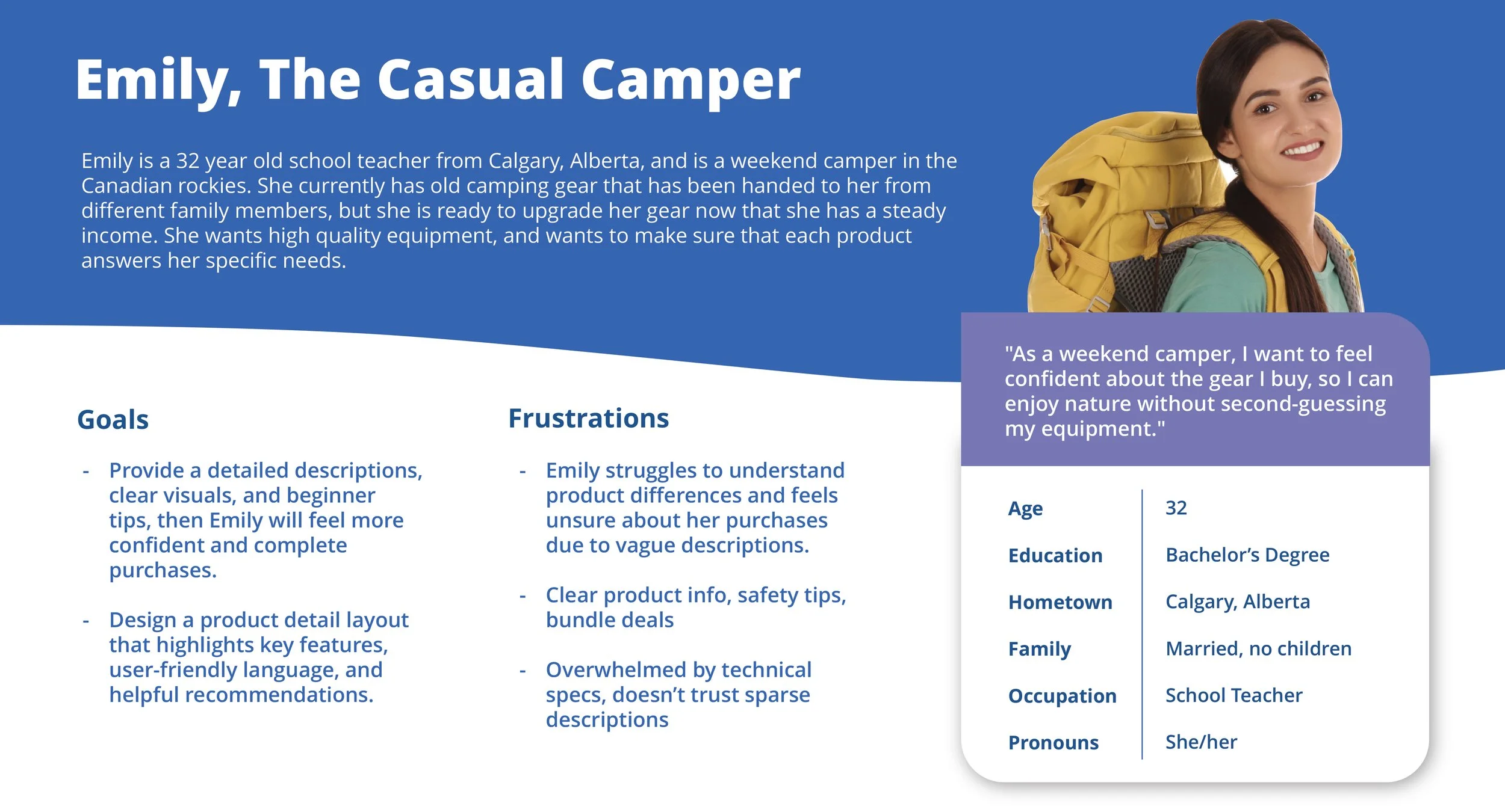
Persona: Emily
Problem statement:
Emily struggles to understand product differences and feels unsure about her purchases due to vague descriptions.
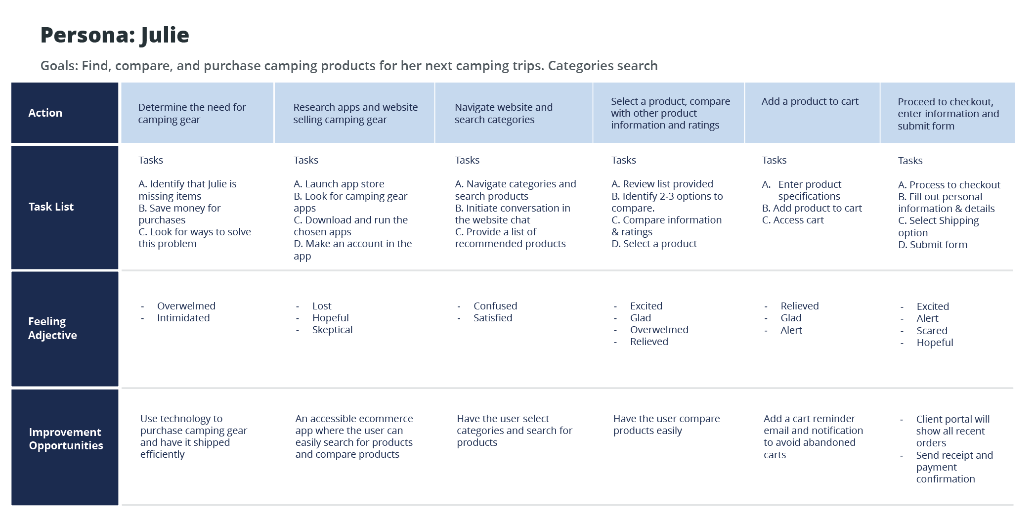
User Journey Map
Mapping out the flow of Julie’s user journey revealed the benefits of creating an app for users without camping gear to find, compare, select, and purchase products for their future camping trips.
Starting the design
Sitemap
I used user-focused flows to ensure that my personas could successfully complete their key objectives while reducing any existing pain points.
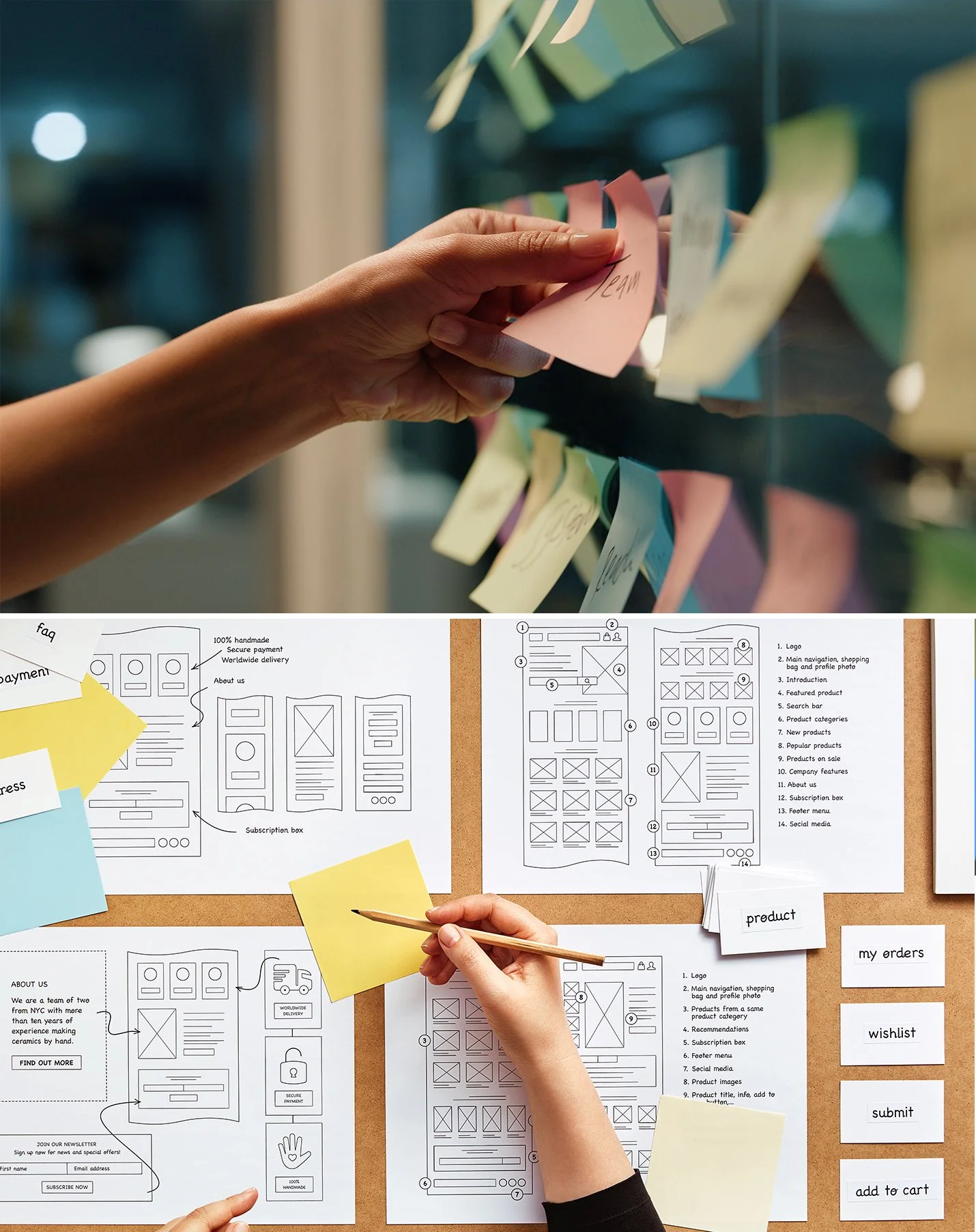
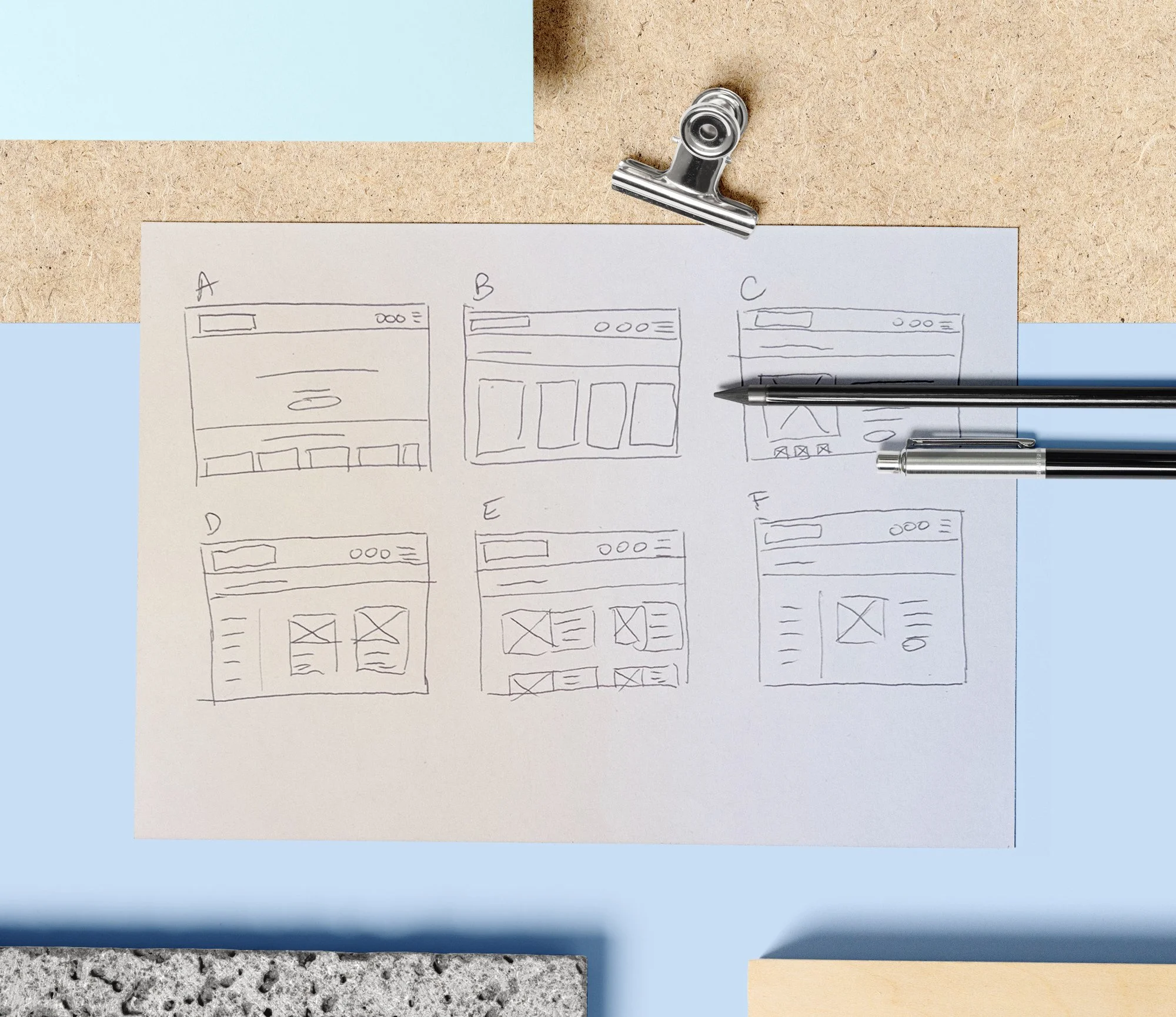
Paper wireframes
Focusing on the core features identified during user research, I sketched the first wireframes using pen and paper.
Paper wireframe screen size variation(s)
I drafted iterations of each screen on paper. I also started to work on designs for additional screen sizes to make sure the site would be fully responsive.
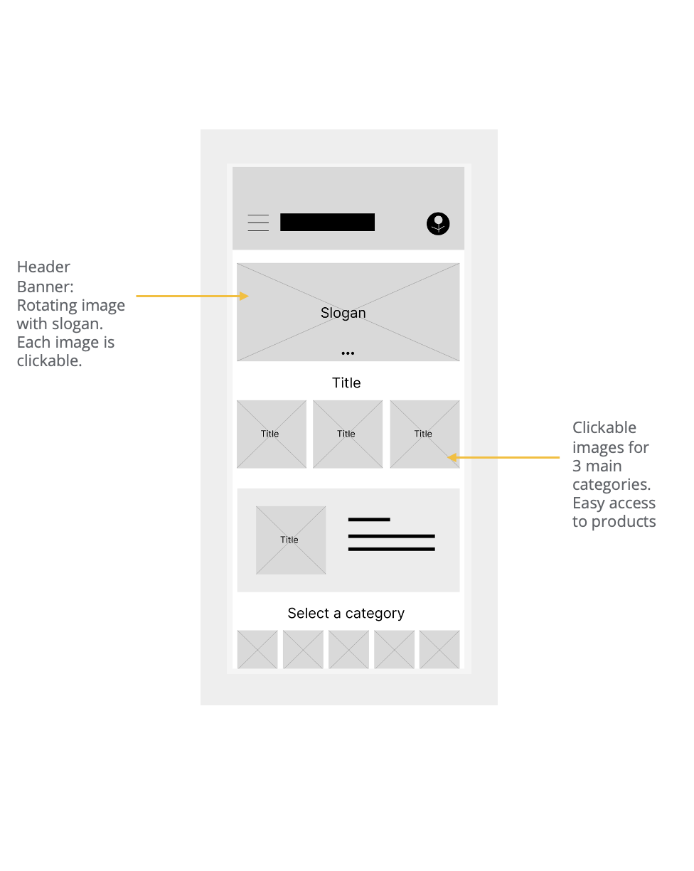
Digital Wireframes
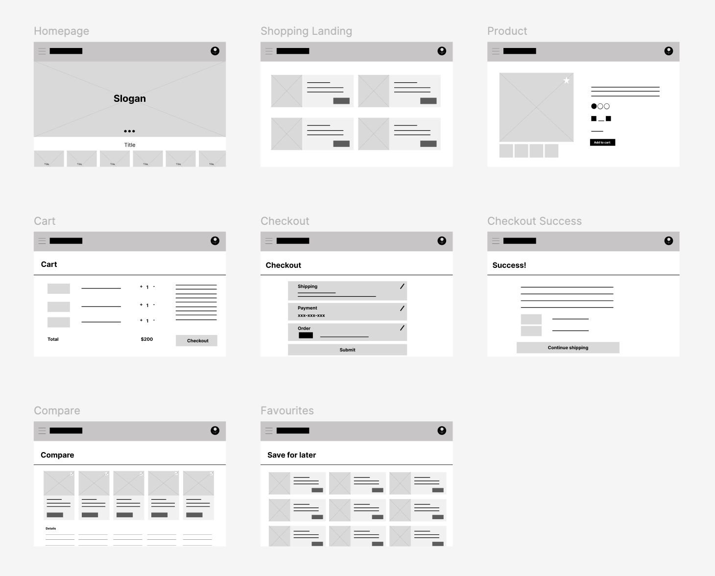
Using wireframes, I put my ideas on paper first and then started to make high-fidelity wireframes. After dozens of iterations, these are the wireframes that best represented user flow and met user needs.
Sketching & Ideation
Using rapid sketching, I created quick UI concepts for:
Product detail page
Filtering sidebar
Mobile navigation
Cart & checkout scree
Home page hero section with rotating promotions and bundles
Prioritized mobile-first design with intuitive bottom nav, sticky cart preview, and collapsible filters.
Low fidelity
prototypes
Mobile: Click the link to access the low fidelity prototype.
Desktop: Click the link to access the low fidelity prototype.
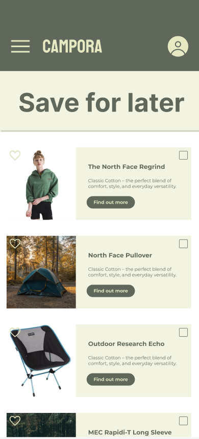
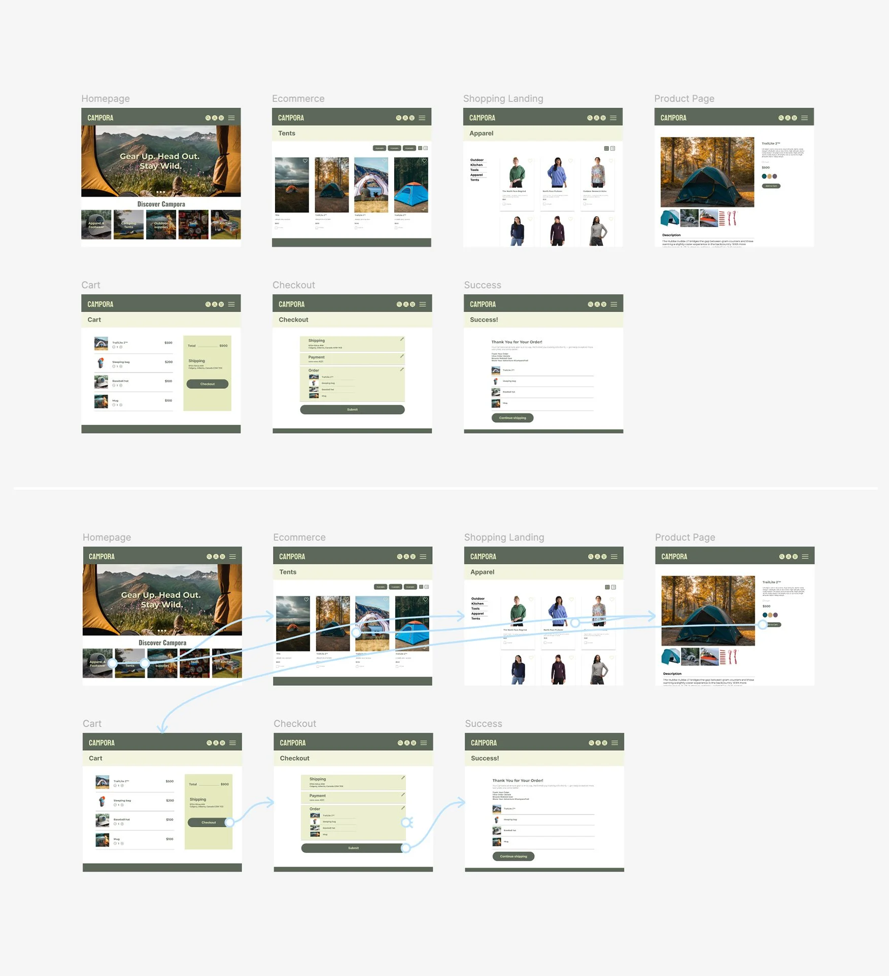
The app design presented is for a camping supply store to advertise and sell its products. The illustration showcases the user flow from the homepage, navigation, shopping landing page, individual product page, cart, checkout, login, sign up, and more.
User flow from landing → category → product → checkout
Usability Study
Findings
One key win was identifying the need for a product comparison feature, which led to a clearer product layout that helped users make more confident decisions. Another was improving the checkout flow by adding a confirmation page and email, directly addressing user concerns about safety and trust—this increased overall user satisfaction and reduced cart abandonment. Iterated based on task completion and user confusion.
Round 1 findings
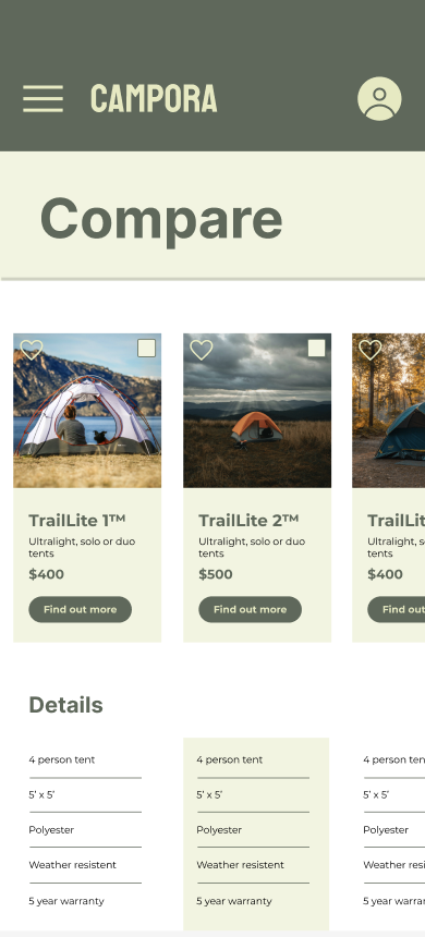
Users want to be able to compare products.
Users want a safe checkout process, a confirmation page.
Users want fast delivery options.
Round 2 findings
Product page: Users consistently skipped lengthy paragraphs. Move compare buttons above the fold.
Too many clicks. Reduce the amount of clicks to get to checkout.
Focus on information clarify, reduce lengthy paragraphs.
Refining the design
Mockups
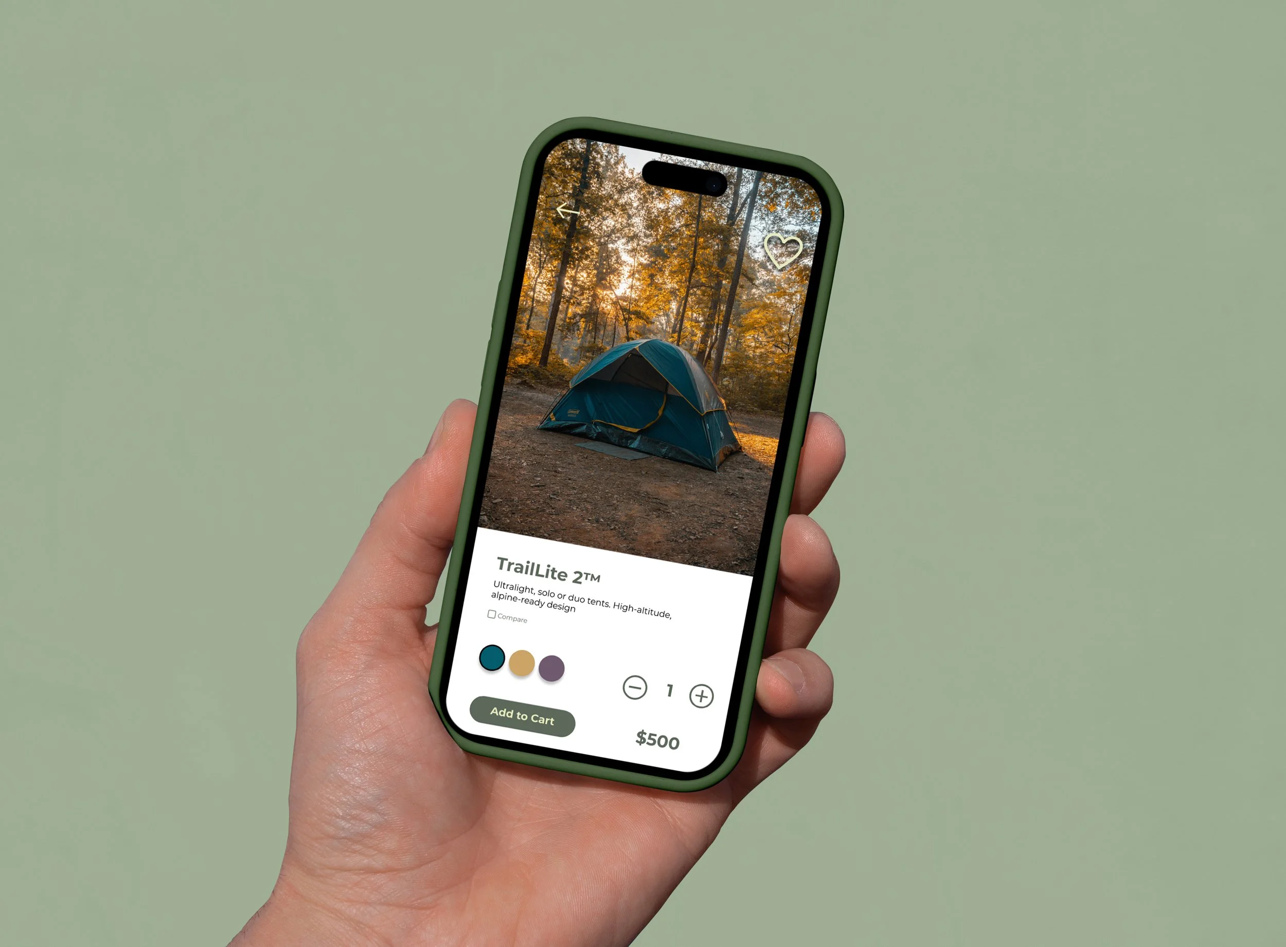
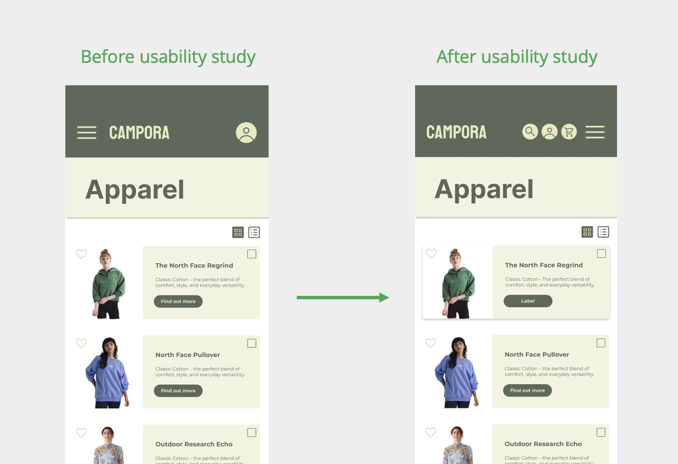
Based on the insights from the usability studies, I applied the design changes, including a clear navigation system and search and more straightforward flow.
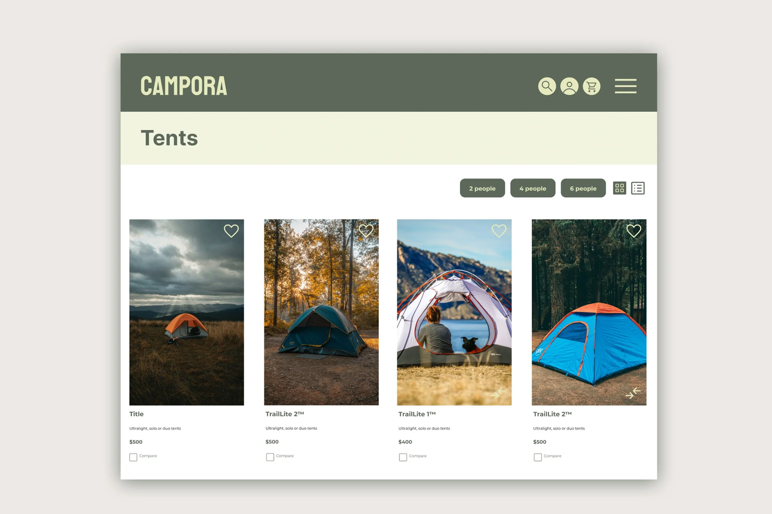
Before the usability study, the clickable links on the top menu navigation were limited. The cards were also missing depth, and the images were getting lost in the background. I rectified this by adding a drop shadow behind each card, and also adding a search and cart icons on the top navigation to facilitate user flow and easy navigation. Moving the hamburger menu to the right also felt more intuitive to the user based on their feedback.
Adding a filter based on the amount of people per tent facilitates navigation. A new option to view the cards in grid or list formats also helps users navigate more freely through the website.
High-fidelity prototype
Accessibility considerations
When choosing a colour palette, I made sure my primary colours met WCAG AA Compliance before building out the UI for each screen.
I am using only 2 typefaces: Montserrat and Koulen for body copy and titles. Mixing too many typefaces can make your app seem fragmented and busy.
I implemented a text hierarchy throughout the app. This helps users to distinguish the different sections and information on screen.
Going forward
Impact:
In this study, I aimed to address common issues faced by users and evaluate the impact of UX design on their mood and decision-making process to purchase products. Through conducting this research and design, I gained a deeper understanding of how user experience can significantly influence a user’s emotions and choices.
Usability Score: +28% increase
Bounce Rate: -28% on product pages
Mobile Conversion: +42%
Customer Feedback: High praise for trust-building product pages
What I learned:
I have gained valuable insights and knowledge through the design process. Some of the key things I have learned include:
Understanding user needs;
Importance of simplicity;
Accessibility considerations;
Understanding & implementing user feedback;
Manage information to not overwhelm the user.
Next Steps
Phase 2: Loyalty program integration
A/B testing on homepage layout
Admin dashboard for real-time inventory and order sync
Expand to rental gear booking functionality
Contact me.
Feel free to contact me if you’d like to discuss a project or see more of my UX work. I’d be happy to share additional case studies and walk you through my design process.

