Casablanca Luxury Villa Barbados
Responsive website design for a luxury villa in Barbados, aimed at elegantly showcasing the property, providing essential guest information, and streamlining the booking process for discerning, high-end clientele. Brand identity development, UI, UX Design using Figma.
Role
Lead UX designer, UX researcher
Year
2025
Client
Casablanca


The goal is to create a user-friendly intuitive digital experience across the website and mobile app for the luxury villa that elegantly showcases the villa’s luxury and exclusivity, provides essential guest information in a clear, intuitive way, streamlines and elevates the booking process for discerning clients, strengthens brand identity to differentiate in the competitive luxury travel market.
— The Goal
The current website doesn’t fully reflect the villa’s luxury brand, isn’t optimized for mobile-first high-net-worth users, and makes it harder than necessary to book or explore the villa’s unique offerings.
Potential guests may leave before booking due to unclear information, dated design, or friction in the booking process.
— The Problem
Role: Lead UX designer, UX researcher
Overseeing the design process;
Ensuring a user-centered approach;
Conduct User research, wireframing, prototyping;
Gather user insights, define product requirements, and develop high quality designs while ensuring technical feasibility and consistency across all platforms.
— Responsibilities
User research


Summary
For my user research, I conducted a combination of qualitative and quantitative methods, including user interviews, surveys, and usability testing to understand the needs, pain points, and behaviours of potential customers. My goal was to gain insights to understand the processes users go through to book the luxury villa and acknowledge the importance of elegant and high-end branding.
Recruited a representative sample
Past guests (families, couples, corporate retreat organizers)
Potential guests planning a luxury Barbados vacation
Travel agents specializing in luxury rentals
Villa staff / concierge (internal user group)
Plan interview questions (sample)
Asked open-ended, neutral questions like:
Tell me about your last villa booking experience — what made it great or frustrating?
When browsing villa websites, what information do you look for first?
How do you usually book luxury accommodation — directly, agent, or platform?
How important are photos, videos, reviews, or floorplans in your decision?
What makes you hesitate before booking a villa online?
On mobile, what’s the biggest frustration when browsing these sites?
Conduct interviews
Gather stories, expectations, frustrations, emotional drivers (examples: safety, exclusivity, peace of mind).

Uncertainty about quality. Hard to tell if the villa truly matches the photos; fear of disappointment.
Pain Point
Pain Point
Limited real guest feedback. Few or no authentic reviews that reassure her it’s worth the high price.
Pain Point

No dedicated agent support. Feels the site is built only for end-consumers, not partners.
Pain Point
Cumbersome booking process. Booking on behalf of clients isn’t streamlined. Booking process feels long, clunky, or confusing, especially on mobile.
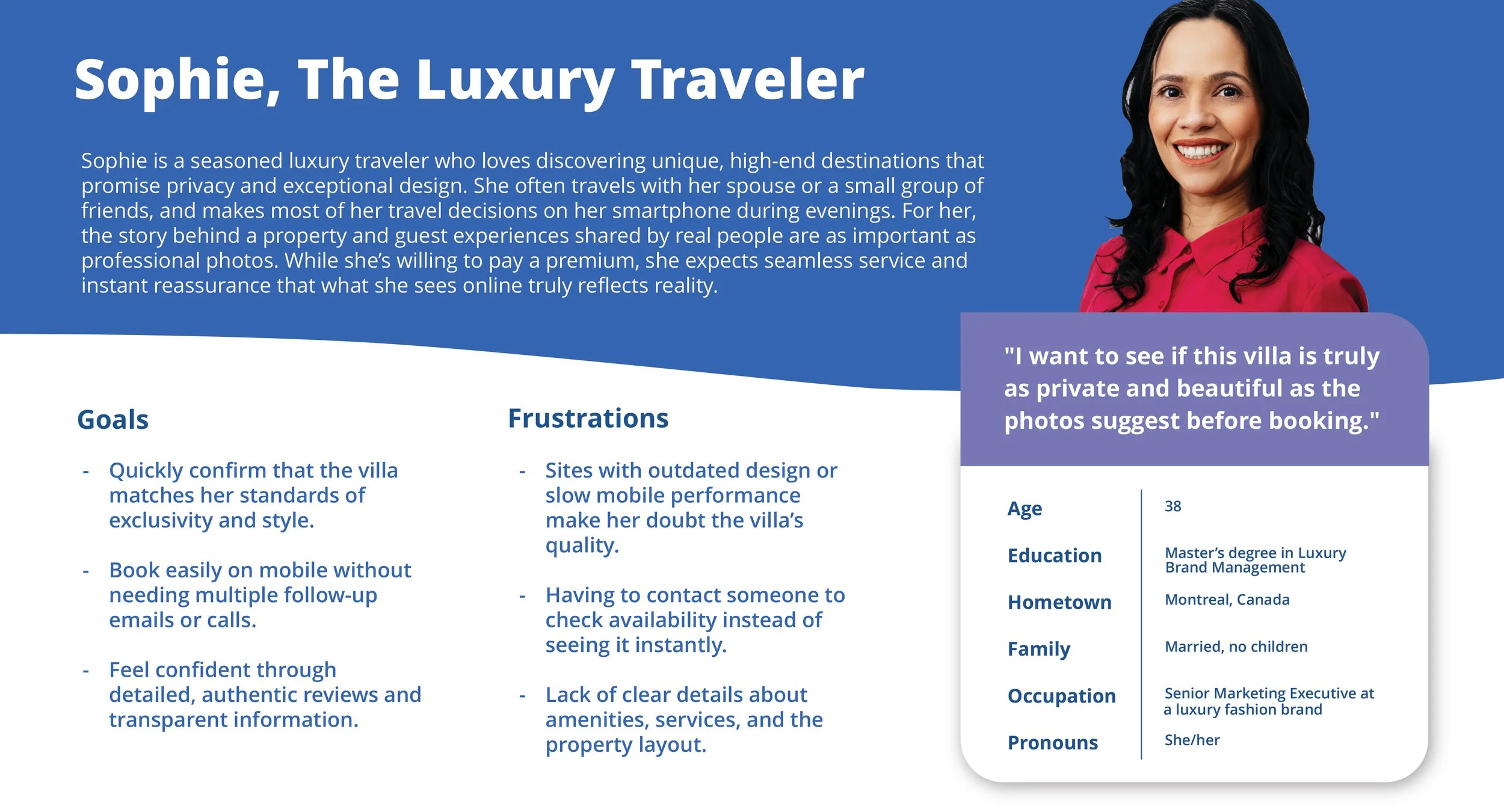

Persona: Sophie
Problem statement:
Sophie wants to feel completely confident that the villa is truly as exclusive, beautiful, and private as it appears online before she commits to booking. However, outdated design, limited authentic reviews, and a lack of clear, mobile-friendly information make her hesitate and prolong her decision.
Persona: James
Problem statement:
James needs quick, reliable access to high-resolution visuals, real-time availability, and detailed villa information so he can create polished proposals for his clients. The current website lacks dedicated agent tools and up-to-date resources, forcing him to waste valuable time emailing back and forth and slowing his workflow.
User Journey Map
Mapping out the flow of Sophie’s user journey revealed the benefits of creating website that helps the her to quickly feel confident the villa meets her luxury standards so she can book without hesitation. Hypothesis statements: If we design an immersive gallery, guest reviews, and clear availability info, Sophie will feel more confident to book directly.
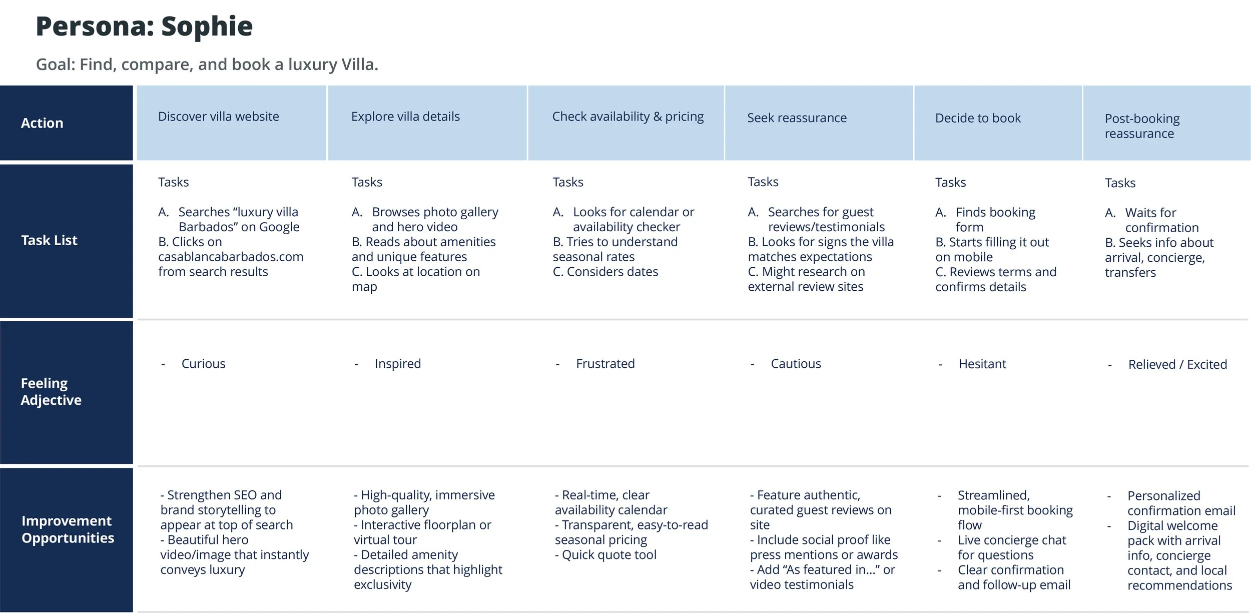
Elevate first impression with hero video, luxury brand voice, and storytelling
Provide transparent real-time availability & pricing
Make authentic social proof visible and central
Design a frictionless, mobile-first booking journey
Offer post-booking reassurance through digital concierge and welcome pack
Goal statements
Increase direct booking rate by 20% in 6 months.
Decrease average time to complete booking by 30%.
Grow travel agent partnerships by providing better tools.
Aligned with business goals: increase revenue, reduce reliance on external OTAs, and strengthen brand image.
How might we (HMW)
HMW help luxury travelers feel the villa’s exclusivity before they arrive?
HMW help travel agents book faster?
HMW reduce decision friction for families?
Starting the design
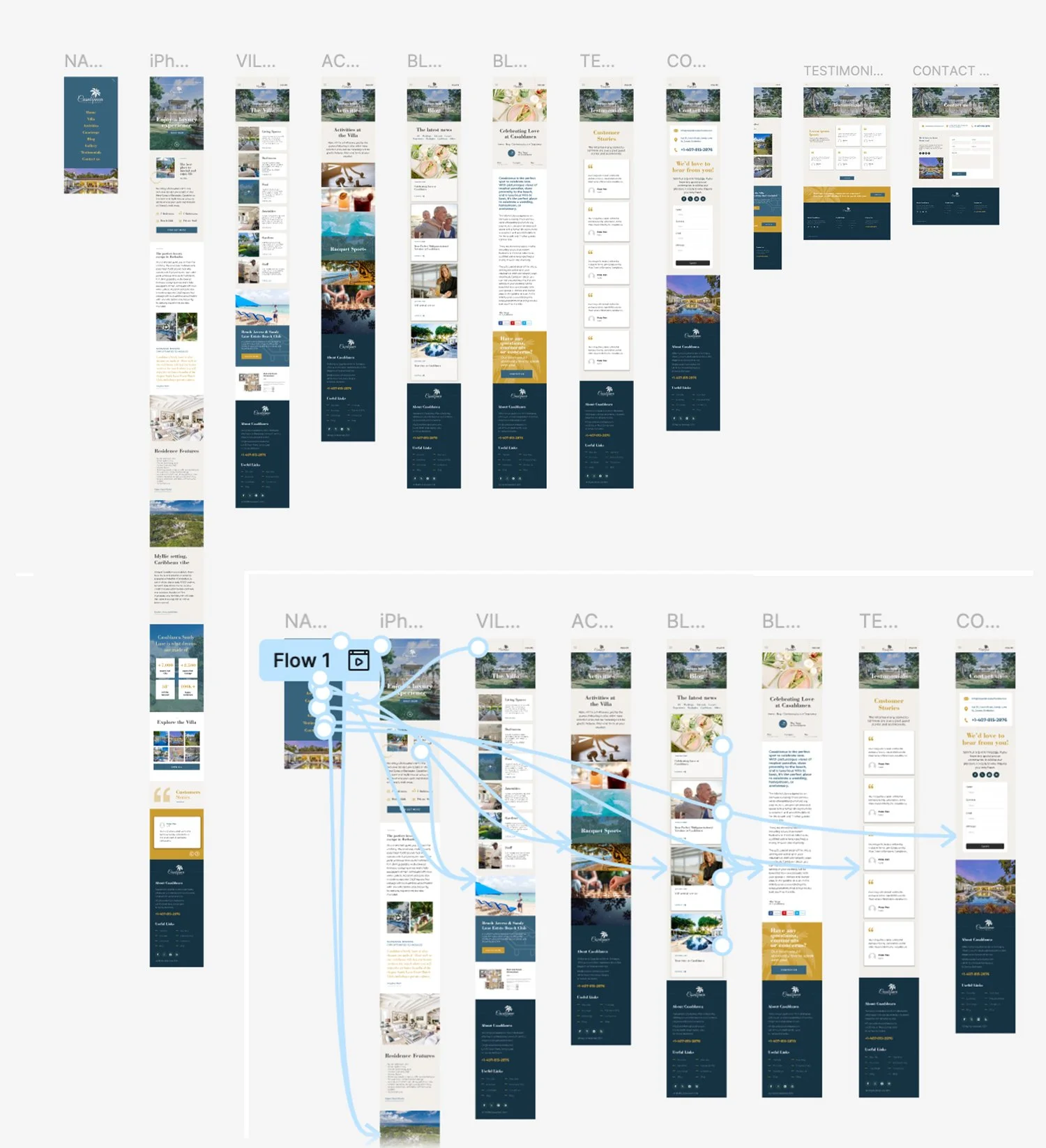
Sitemap
I used user-focused flows to ensure that my personas could successfully complete their key objectives while reducing any existing pain points.

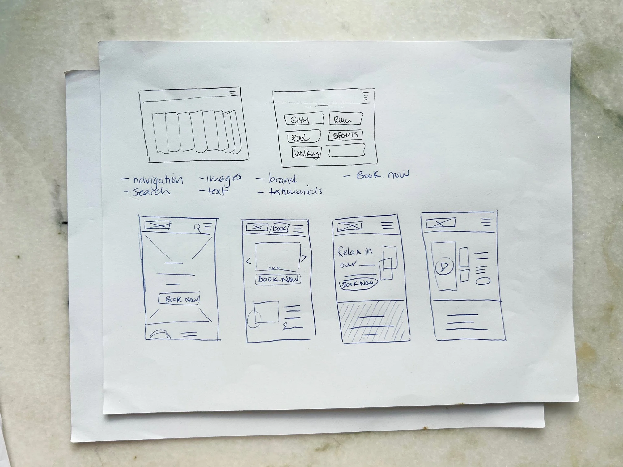
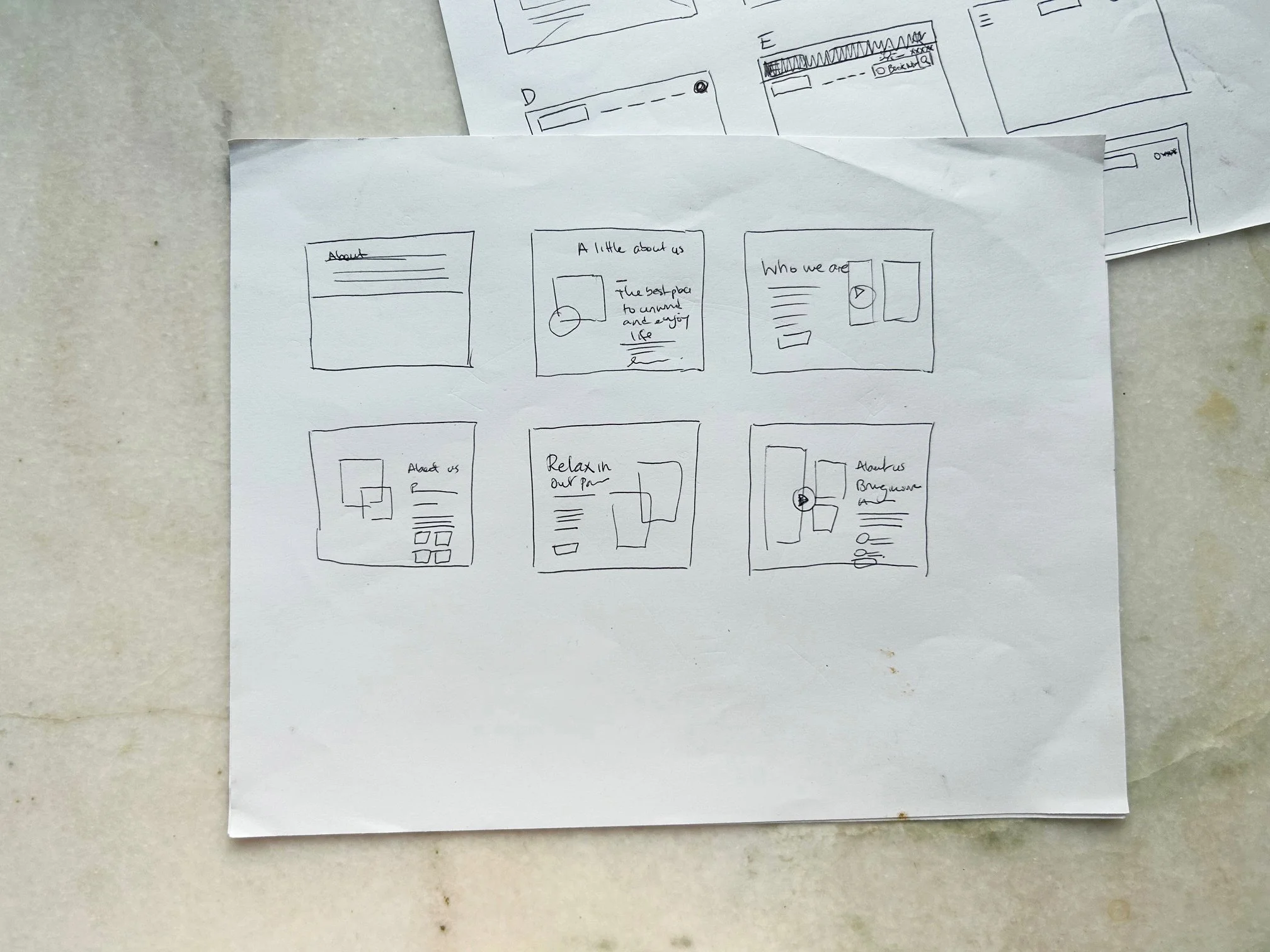
Paper wireframes
Focusing on the core features identified during user research, I sketched the first wireframes using pen and paper.
Paper wireframe screen size variation(s)
I drafted iterations of each screen on paper. I also started to work on designs for additional screen sizes to make sure the site would be fully responsive.


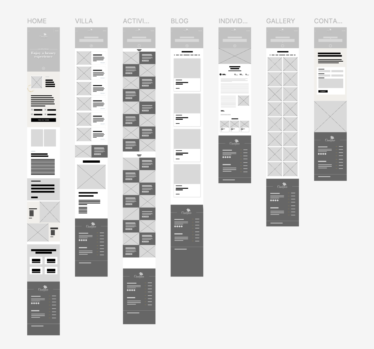
Digital Wireframes
Using wireframes, I put my ideas on paper first and then started to make high-fidelity wireframes. After dozens of iterations, these are the wireframes that best represented user flow and met user needs.
Sketching & Ideation
Using rapid sketching, I created quick UI concepts for:
Homepage hero section with rotating images and clear slogan and Book now button;
Villa page featuring one card per major category. Ex: Living spaces, bedrooms, swimming pool, amenities, etc. Each card will be connected to a lightbox;
Activities, Blog, Individual Blog article, Gallery, Contact us pages;
Prioritized mobile-first design with intuitive bottom nav, sticky cart preview, and collapsible filters.

Low fidelity
prototypes
Mobile: Click the link to access the low fidelity prototype.
Desktop: Click the link to access the low fidelity prototype.
The app design presented is for a camping supply store to advertise and sell its products. The illustration showcases the user flow from the homepage, navigation, shopping landing page, individual product page, cart, checkout, login, sign up, and more.
User flow from Home → Explore Villa → View Gallery → Read Testimonials → Contact us

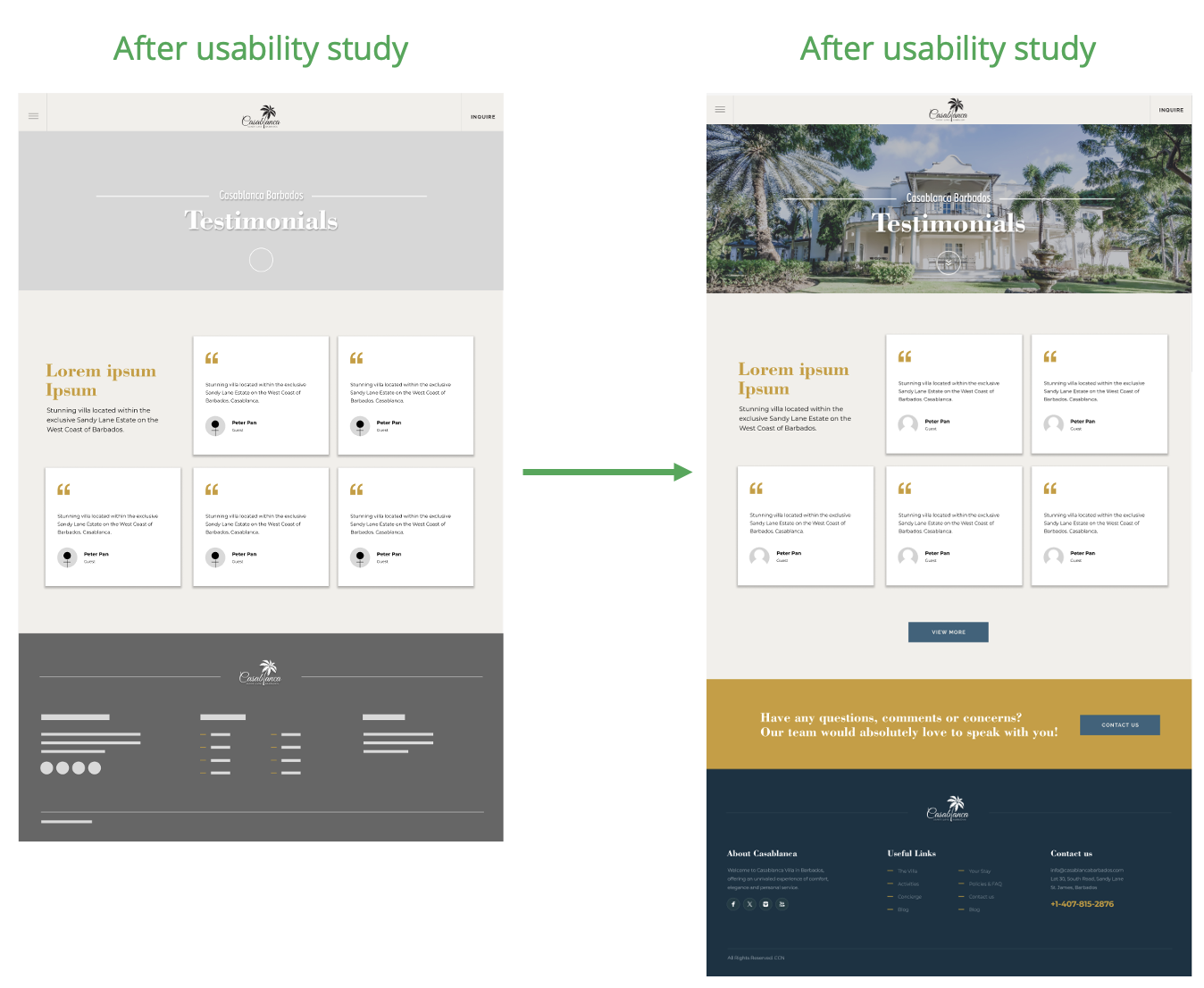
Usability Study

Findings
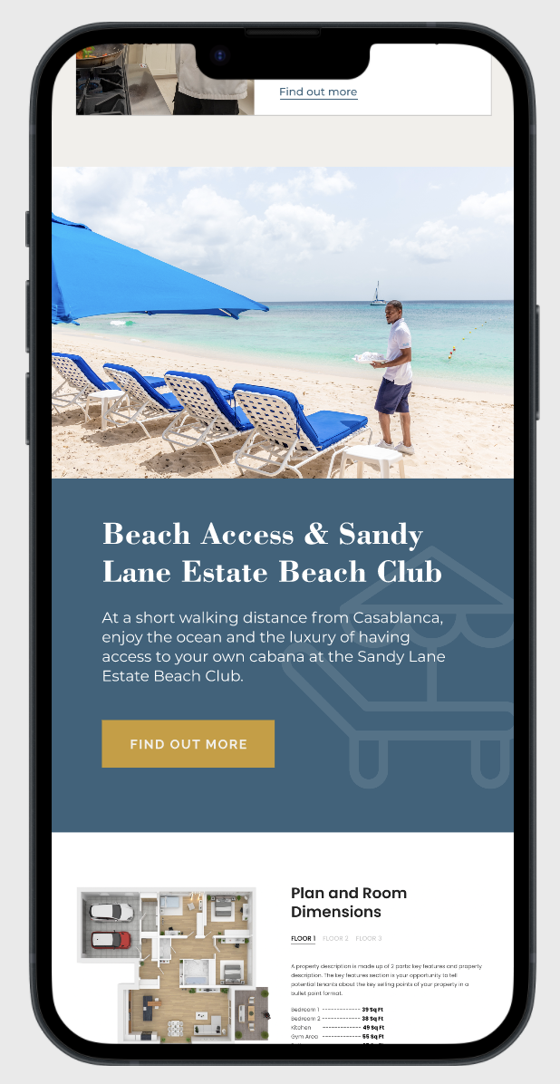
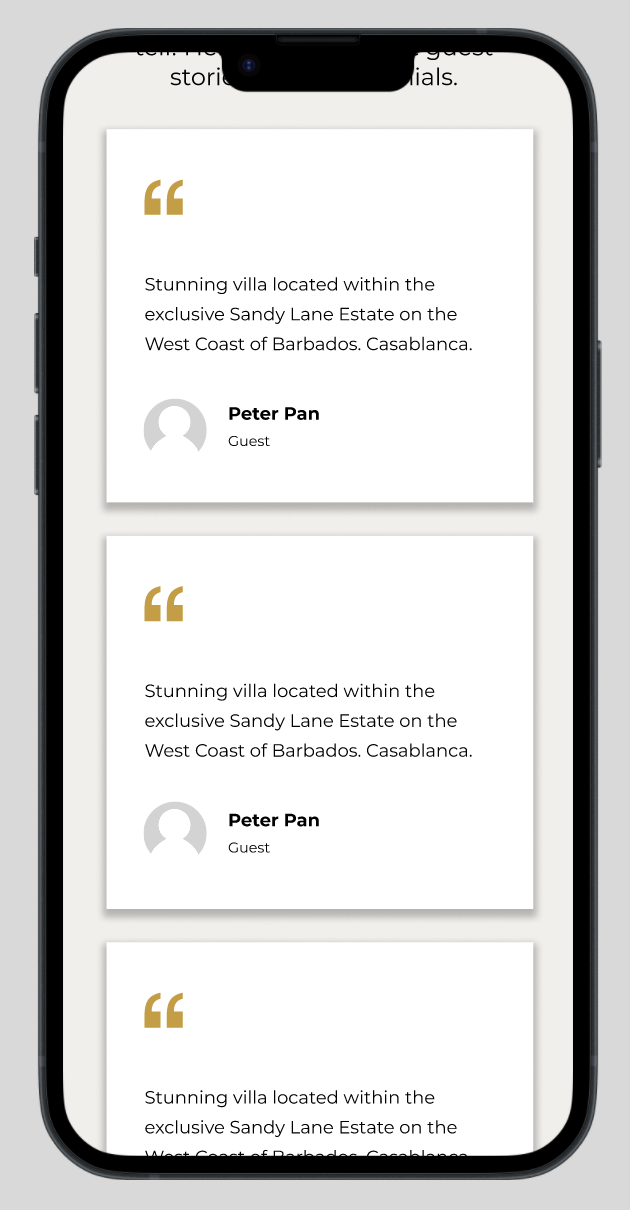
One key win was identifying the need to sprinkle testimonials throughout the website. A few reviews on specific key pages will help. Also creating a page for testimonials, allowing users to navigate to is to reinforce the feeling of confidence in the product and lead the user to booking the villa. Another important observation was the importance to prioritize the availability calendar and the Book Now button front and center. Based on my observations, I also needed to add more clear call to actions.
Round 1 findings
Users struggled to locate real-time availability.
Users need to see a testimonials page and also testimonials sprinkled throughout the website.
Users were not sure what services were included
Round 2 findings
Rearranged home screen to prioritize calendar + “Book Now”.
Add more clear call to actions.
Agent didn’t find media kit quickly.
Refining the design
Mockups
Based on the insights from the usability studies, I applied the design changes, including a testimonials page and adding a few testimonials on each page.
Adding ‘’Availability calendar’’ and ‘’Book Now’’ buttons in key areas of the website also adds a more staight forward flow.
Before the usability study, we were missing a section that shows precicely what was included in terms of services. By tweaking the wording and putting forward a few key details, we were able to put this information forward.
A few clear call to actions were also added to direct the flow of traffic towards the ‘’Inquire’’ and ‘’Contact us’’ pages.


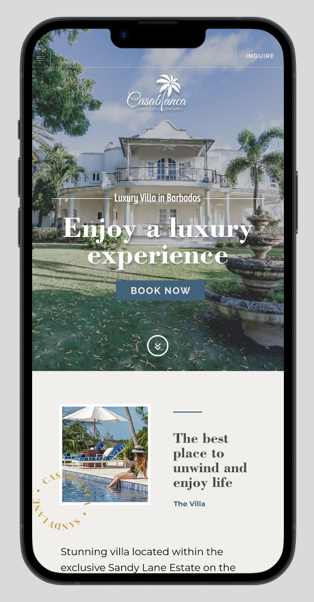
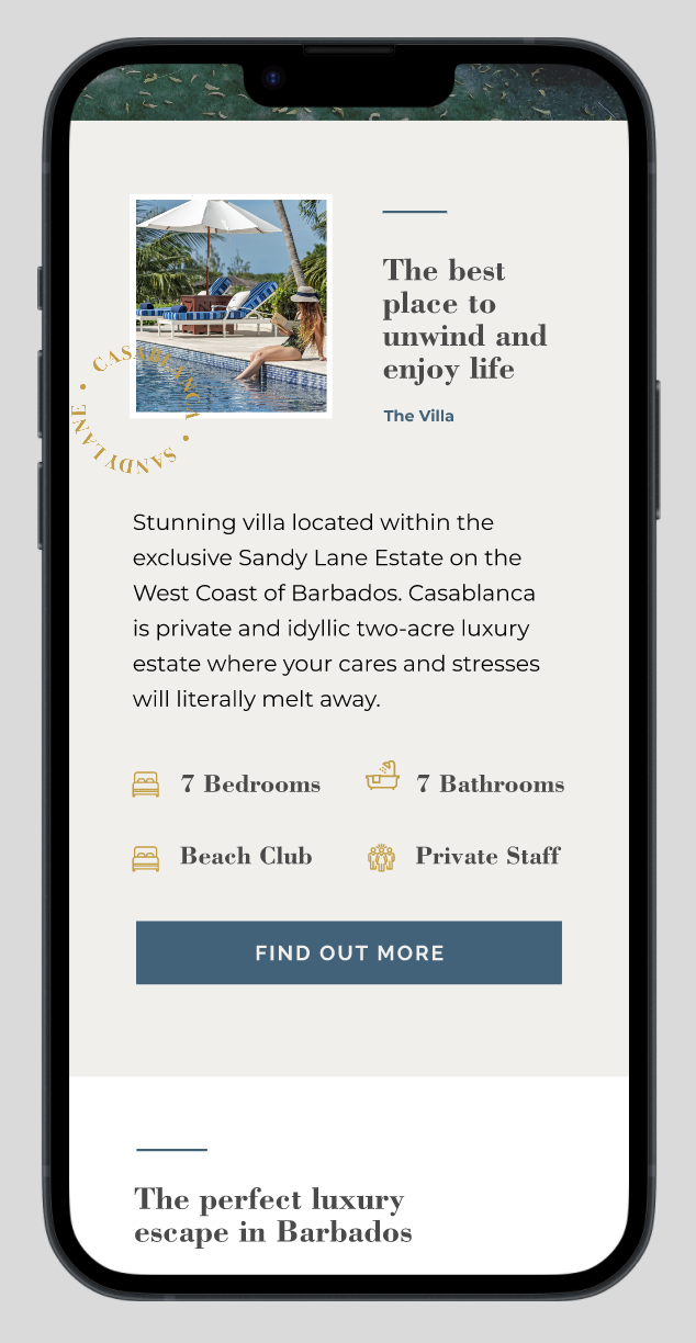


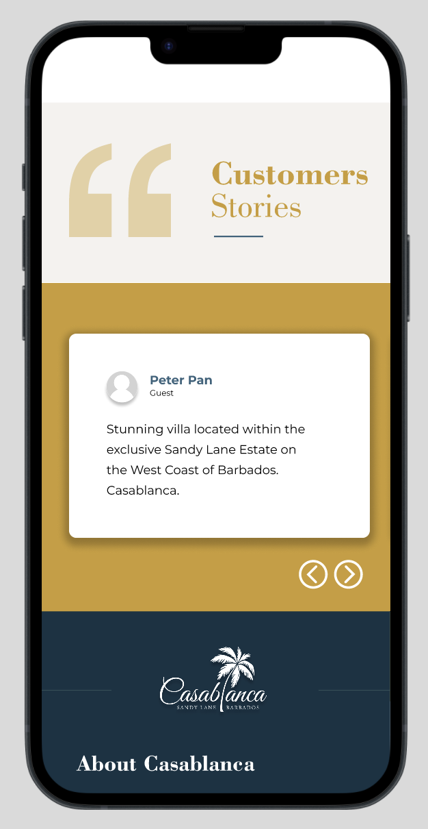
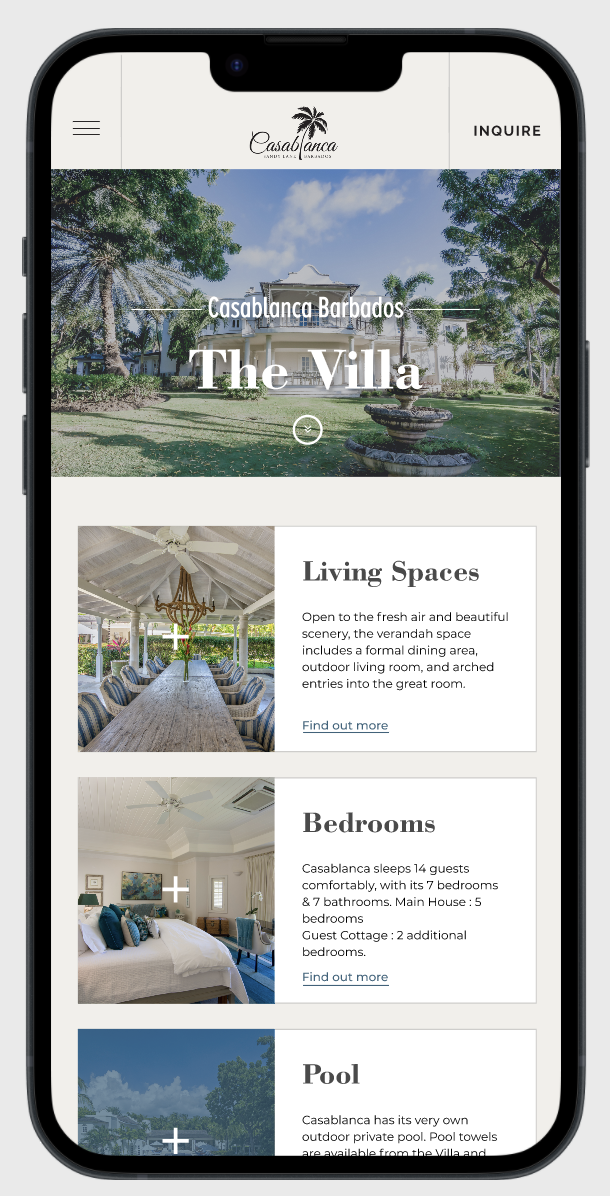
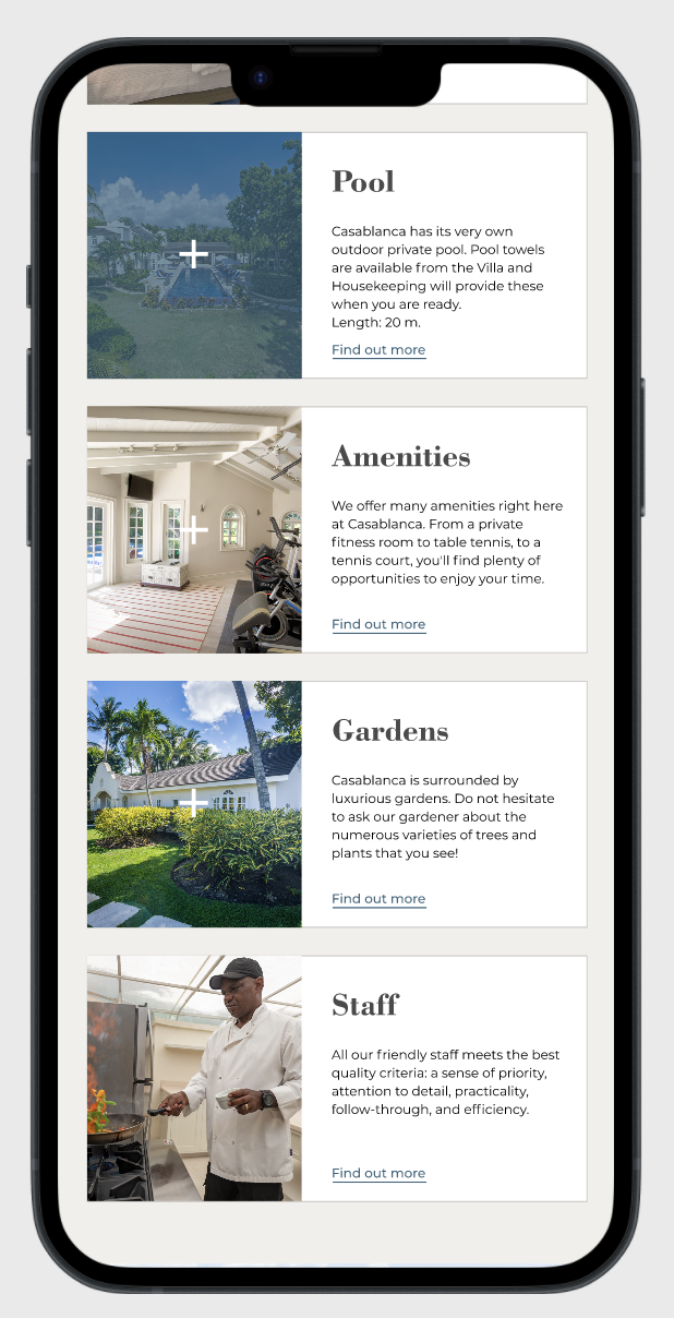


High-fidelity prototype
After finalizing the low-fidelity prototype, I worked on creating the final designs with the goal of making them more intuitive and navigable. The main colour theme I used came from Casablanca’s pre-existing branding, representing the ocean and luxury. By using different shades and tones of the blue and bronze, I was able to achieve the proper feel of luxury I was looking for.

Accessibility considerations
When choosing a colour palette, I made sure my primary colours met WCAG AA Compliance before building out the UI for each screen.
I am using only 2 typefaces: Bodoni Bd (serif) for titles / subtitles and Montserrat (sans-serif) for body copy and titles. Mixing too many typefaces can make a design seem fragmented and busy.
I implemented a text hierarchy throughout the app. This helps users to distinguish the different sections and information on screen.
To ensure consistency:
Creation of a sticker sheet.
Going forward
Impact:
The research and design process deepened my understanding of the powerful role user experience plays in shaping emotions and guiding choices.
Customer Feedback: High praise for trust-building of luxury brand when booking online.
This case study demonstrates how thoughtful, user-centered design can transform the online booking experience for a luxury villa. By prioritizing clarity, emotional resonance, and ease of use, the project not only addressed user pain points but also laid the groundwork for a more intuitive and engaging digital journey. Moving forward, these UX principles can guide future iterations and help ensure the experience continues to meet the needs and expectations of high-end travelers.
What I learned:
I have gained valuable insights and knowledge through the design process of a luxury villa rental. Some of the key things I have learned include:
Understanding user needs;
Importance of simplicity and usability;
Accessibility considerations;
Understanding & implementing user feedback;
Manage information to not overwhelm the user.
Usability and peer feedback influences each iteration of the design.
Next Steps
Admin dashboard for travel agents, complete with information kits and real-time availability calendar.
When I have documented all feedback that was provided, I will make the necessary design updates in order to improve the website’s overall experience.
Create a cross-platform responsive design. The goal is to build the same experience for all users, no matter what type of device they are using.