EduMatch
Designed an app that enable tutors to list their services and parents to search for and book time with tutors.
Role
Lead UX designer, UX researcher
Year
2025
Client
EduMatch

The goal is to design an intuitive platform that enables parents to confidently find and book qualified tutors for their children, while empowering tutors to easily showcase their services, manage their schedules, and attract consistent clients.
This goal addresses both user needs (ease, trust, efficiency) and business objectives (engagement, bookings, retention).
— The Goal
Parents struggle to find trustworthy, available tutors who match their child’s needs and schedule, while tutors lack an effective platform to promote their expertise, manage bookings, and build a steady client base. The business lacked an online presence and wanted to expand its reach by creating a digital storefront.
It highlights pain points for both primary user groups (parents and tutors), framing the opportunity for EduMatch to bridge that gap with clear value.
— The Problem
Role: Lead UX designer, UX researcher
Overseeing the design process;
Ensuring a user-centered approach;
Conduct User research, wireframing, prototyping;
Gather user insights, define product requirements, and develop high quality designs while ensuring technical feasibility and consistency across all platforms.
— Responsibilities
User research
Summary
For my user research on EduMatch, I used a combination of qualitative and quantitative methods—including user interviews, an online survey, and competitor usability testing—to understand the behaviors, needs, and frustrations of both parents searching for tutors and tutors offering their services. Initially, I assumed that parents would prioritize a fast and flexible booking experience above all else, while tutors would be focused primarily on promoting their qualifications. However, the research revealed that trust, transparency, and communication were the most critical factors for both groups. Parents wanted to feel confident in the tutor’s credibility and fit for their child before booking, while tutors were more concerned with getting matched with the right clients and managing their time effectively. This insight led to a design strategy that prioritizes detailed tutor profiles, transparent availability, and streamlined communication tools—ultimately improving user confidence and platform trust.
Research Methods
User Interviews (12 participants: 6 parents, 6 tutors)
Online Survey (95 respondents: mix of parents and tutors)
Usability Testing of 3 competitor platforms
Empathy Mapping & Persona Development
Interview Planning and Scripting
Interview Planning
Recruited a diverse group:
Parents with children at different education levels (primary, secondary), urban and rural. From different regions and school systems.
Tutors with varying levels of experience (new freelancers to certified professionals) and age.
Focused on open-ended, neutral questions such as:
“Can you walk me through how you typically find a tutor or list your services?”
“What do you look for to feel confident booking or accepting a session?”
“Tell me about a time when a tutoring experience didn’t go as expected.”
Interviews
Use 1:1 video or in-person sessions (30–45 min each).
Record (with permission) and take observational notes.
Build rapport through friendly intros and contextual prompts.
Key Insights
1. Initial assumption: Parents prioritize fast booking, and tutors want profile visibility.
2. Actual insight: Both parents and tutors prioritize trust, clear communication, and control. Parents need rich, transparent profiles and messaging before booking. Tutors care more about time management and client fit than visibility alone.


Pain Point
Lack of Trustworthy Information: Parents struggle to assess the quality, credibility, and teaching style of tutors due to limited profile details, unclear qualifications, or lack of social proof (e.g., reviews or ratings).

Pain Point
Unclear Availability & Communication: Booking a tutor is often frustrating due to unclear scheduling, inconsistent availability, or difficulty communicating directly before making a decision.

Pain Point
Time Management Challenges: Tutors find it difficult to manage their availability and avoid last-minute cancellations or overbookings when the platform doesn’t offer flexible, real-time scheduling tools.

Pain Point
Mismatch with Clients: Tutors frequently get inquiries from clients who aren’t a good fit—either in terms of subject, student level, or expectations—because current platforms lack effective filters or onboarding questions to ensure compatibility.

Persona: Anton
Problem statement:
Anton is a qualified, full-time tutor who struggles to find consistent, high-quality clients online. Despite having the credentials and experience, he finds it difficult to build trust quickly with new parents and manage his schedule efficiently across multiple platforms. He needs a reliable and professional tool that helps him showcase his expertise, establish credibility, and book recurring sessions with minimal admin work.
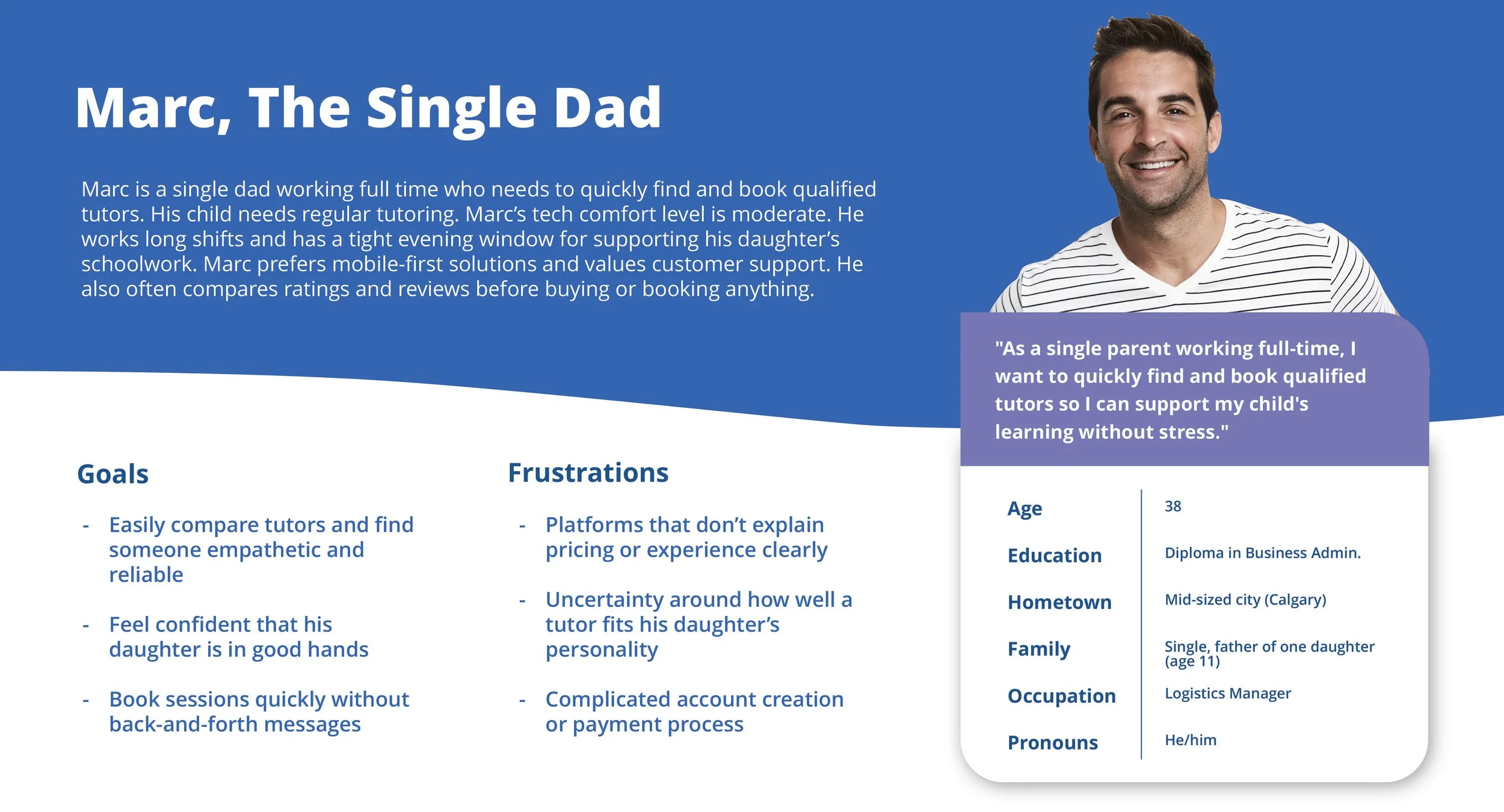
Persona: Jennifer
Problem statement:
Jennifer is a working professional and mother of three boys, two of whom have learning disabilities. She is overwhelmed by the complexity of finding specialized tutors and doesn't have time to learn or navigate a complicated app. She needs an intuitive, easy-to-use platform that allows her to quickly filter by qualifications and availability, and book trusted tutors without wasting time or repeating tasks every week.
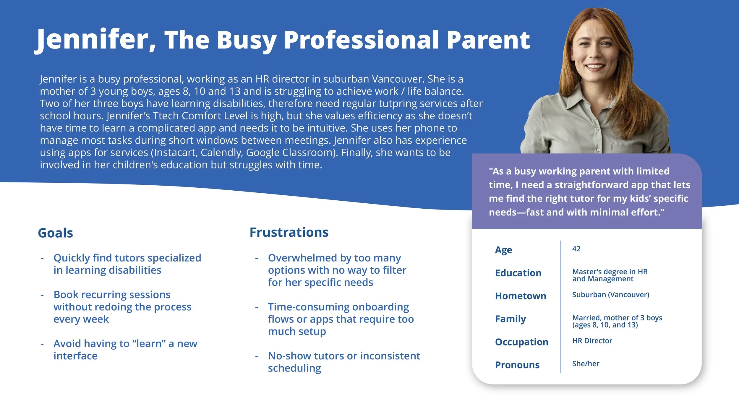
Persona: Marc
Problem statement:
Marc is a single father with limited time and no support system to help his daughter academically. He finds it stressful and time-consuming to search, compare, and book tutors, especially when important information like teaching style or personality fit isn’t clear. He needs a simple, fast way to confidently book a tutor who is reliable and matches his daughter’s needs without added stress.
User Journey Map
Mapping out the flow of Marc’s user journey revealed the benefits of creating an app that is efficient, easy to use and bridges communication gaps.
- Trust is Critical—but Hard to Build. Marc feels unsure whether a tutor will be a good fit just from a short bio or profile. Trust must be established quickly through profile design and social proof.
- Clarity Reduces Stress. Marc is motivated to book a tutor quickly, but the process is often slowed down by: long account setups, confusing booking flows and inconsistent availability.
Marc becomes frustrated when pricing, availability, or qualifications aren’t immediately clear.
- Efficiency Is a Must. The booking flow must be streamlined, especially on mobile, with as few steps as possible.
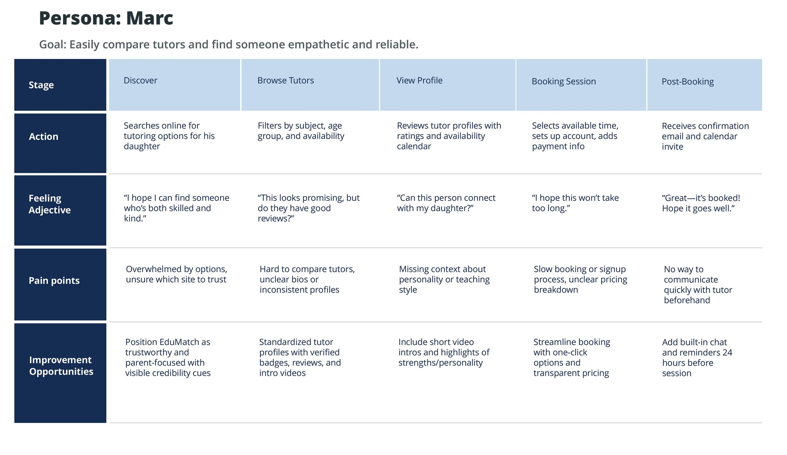
Add short video intros and verified badges to tutor profiles to build trust.
Use a standardized profile layout that clearly displays qualifications, experience, teaching style, and pricing.
Implement a guided, step-by-step booking flow with default settings to reduce time spent.
Introduce pre-session chat or Q&A features to improve parent-tutor connection.
“How Might We” (HMW) Exercise
HMW help parents feel confident when selecting a tutor?
HMW help tutors stand out in a crowded marketplace?
HMW make scheduling sessions frictionless?
Starting the design
Sitemap
I used user-focused flows to ensure that my personas could successfully complete their key objectives while reducing any existing pain points.

Paper wireframes
Focusing on the core features identified during user research, I sketched the first wireframes using pen and paper.
Paper wireframe screen size variation(s)
I drafted iterations of each screen on paper. I also started to work on designs for additional screen sizes to make sure the site would be fully responsive.
Rapid Sketching
Ran multiple sketching sprints for:
Tutor profiles
Search filters
Booking flow
Review & rating systems


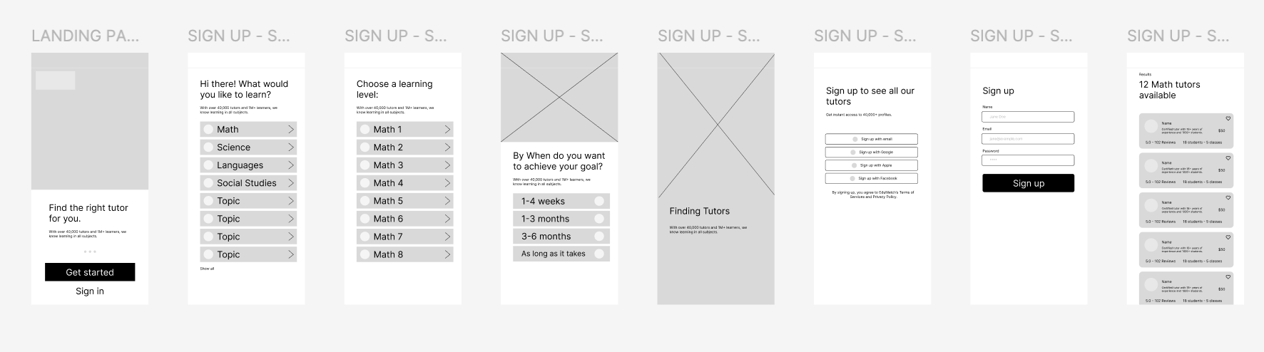
Digital Wireframes
Using wireframes, I put my ideas on paper first and then started to make high-fidelity wireframes. After dozens of iterations, these are the wireframes that best represented user flow and met user needs.
Design core screens:
Landing page
Sign up process
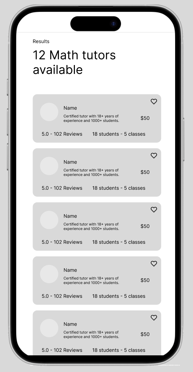
Search results
Tutor profiles
Booking flow (select → pay → confirm)
Parent/tutor dashboards
Used industry-standard components (inputs, CTAs, cards).
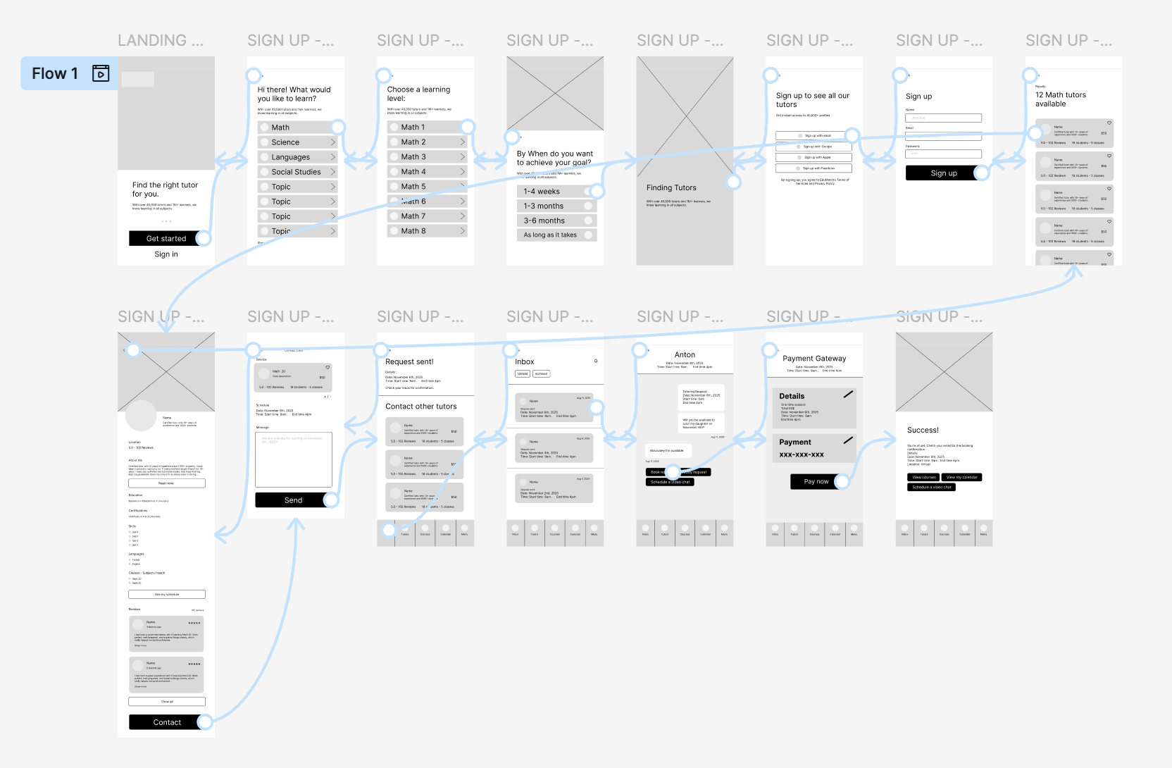
Connected Prototypes
Used Figma to link actions (e.g., “Book Now” → confirmation).
Validated flow logic against earlier diagrams and made adjustments.


Low fidelity prototypes
Mobile: Click the link to access the low fidelity prototype.
The app design presented is for an app that enable tutors to list their services and parents to search for and book time with tutors. The illustration showcases the user flow from the landing page, sign up process, searching / finding a tutor, individual profile page, submitting a request, checkout, and more.
Usability Study


Findings
In two rounds of moderated usability testing with parents and tutors, users were able to complete most tasks successfully but encountered key friction points related to profile clarity, scheduling, and navigation flow. While the concept and value of EduMatch were positively received, both user groups expressed the need for more transparency and better organization of content. Following the first round of testing, key improvements were made to tutor profile layouts and calendar interactions, which significantly reduced confusion in the second round.
Round 1 findings
Users struggled to understand tutor availability due to unclear calendar interaction.
Tutor profiles lacked trust-building elements like verified badges or user reviews.
Parents were confused by the navigation flow between browsing tutors and booking.
Round 2 findings
Updated calendar design improved task completion time for booking sessions.
Users felt more confident booking tutors after seeing added profile enhancements.
Minor friction remained in switching between tutor list view and individual profiles.